Tuesday, 20 April 2010
Evaluation Feedback
As well as asking three of our target audience for feedback, we also put our video on YouTube for others to comment on. The comments we got were very positive and gave us feedback on what we could improve if we did it
 again.
Wednesday, 17 March 2010
Chosen Advert
From the questionnaire results you can see that our advert draft one was more appealing to our target audience.

Advert Questionnaire Feedback
We decided to get feedback on our two advert drafts to help decide what would be best for our final product. As our target audience is 14-18 year old boys and girls, we will ask 2 males and 2 females from each age group to fill in our questionnaire. This will mean that we will end up with 20 opinions on our adverts from our target audience, helping us learn what would appeal to them in a magazine and make them want to buy the digipak.
1. Which advert most appeals to you?
Advert draft one ||||| ||||| |
Advert draft two ||||| ||||
2. Which background image appeals most to you?
Advert draft one ||||| ||||| |||
Advert draft two ||||| ||
3. Which advert draft one catch your eye in a magazine?
Yes ||||| ||||| ||||| |||
No ||
4. Would advert draft two catch your eye in a magazine?
Yes ||||| ||||| ||||| |
No ||||
5. Does the artist name stand out enough to catch your attention on either advert?
Advert draft one
Yes ||||| ||||| ||||| ||||
No |
Advert draft two
Yes ||||| ||||| ||||| ||||
No |

Advert Draft One
This is the advert that i drafted. I have chosen to use this background image on my draft to keep to the same theme as our digipak. I ha ve kept to the same theme to make sure the band is recognisable. From analysing other adverts, especially 'The Killers', the masthead reads 'The Thrillers' in large font, making the band name known immediately and draws in the eye. I have placed the album title directly underneath this in smaller, orange font. The font colour connotes the 'burning' and although it is smaller than the band name it still stands out against the dark background colour.
 ve kept to the same theme to make sure the band is recognisable. From analysing other adverts, especially 'The Killers', the masthead reads 'The Thrillers' in large font, making the band name known immediately and draws in the eye. I have placed the album title directly underneath this in smaller, orange font. The font colour connotes the 'burning' and although it is smaller than the band name it still stands out against the dark background colour.
Chosen Digipak
From looking at our draft digipaks and our feedback questionnaire, we decided to incorporate ideas from both into our final product. We found from our questionnaire that our target audience prefered the inside panels to be darker than the outside, and that digipak draft one was too similar on all the panels. We also found that they liked the idea of placing a photo of the band on the inside panels to distinguish the members of the band.


Monday, 15 March 2010
Digipak Questionnaire Feedback
We decided to get feedback on our three digipaks drafts to help decide what would be best for our final product. As our target audience is 14-18 year old boys and girls, we will ask 2 males and 2 females from each age group to fill in our questionnaire. This will mean that we will end up with 20 opinions on our digipaks from our target audience, helping us learn what they like and would buy if they saw it in a shop.
1. Which digipak front cover stands out the most to you?
Digipak draft one ||||| ||||| |||
Digipak draft two ||||| ||
2. Which digipak has the most appealing inside covers?
Digipak draft one ||||| |||||
Digipak draft two ||||| |||||
3. Do you prefer the darkness of the inside panels on digipak draft two to the bright theme running through all of digipak draft one?
Yes ||||| ||||| ||
No ||||| |||
4. Which digipak back cover is most appealing to you?
Digipak draft one ||||| ||||| |
Digipak draft two ||||| ||||
5. Which digipak has the most appealing disc panel?
Digipak draft one ||||| ||||
Digipak draft two ||||| ||||| |
6. Which digipak has the most interesting font on the back cover?
Digipak draft one ||||| ||||| ||
Digipak draft two ||||| |||
7. Do you think that having a photo of the band on the inside panel is appealing?
Yes ||||| ||||| ||||| |||||
No

Digipak Draft One
 This is the digipak that i drafted. I have used a continuous colour scheme throughout, keeping the continuity of the digipak, and have used parts of the same image to also convey this. I have used a main image on the front cover which i have then incorporated into the other panels. I think that the colours i have used draw the consumer in immediately because of the bright and contrasting orange and black on the front cover. The masthead 'The Thrillers' is based in the middle of the front cover, much like 'The Killers' digipaks that i researched. This clearly conveys the name of the band but without it being the main focus of the cover. 'Burning mess' is written underneath the masthead in a colour that blends into the background image, but also stands out as the digipak name. The background image links with the title of the digipak, 'burning', keeping a theme to every panel. The back panel of my digipak includes a section of the background image on my front cover. I did this to keep to the same theme and album name. The church is the focal point on the back cover and conveys a village, in which our photo was taken and our music video is set. I have listed the song titles to keep them clear to the audience and in the order that they would play on the digipak. I have placed them to the left of the back cover to ensure that the focal point can still be seen and the orange colour of the background stands out, this is to convey that this is a 'Thrillers' digipak because of the theme used, and show that it is linked to the front cover, ensuring people know the artist of the digipak if they see the back cover. My three inside panels continue the 'burning' theme and i have used a background image of a bonfire to convey this. I have placed a photo of each band member on one of the inside panels to distinguish that the digipak contains 'The Thrillers' music and not other music with the same name.
Saturday, 13 March 2010
The Thrillers
Because of copyright laws we must change the name of our band and album; we must also change the song titles. We chose to name our band 'The Thrillers' and the digipak 'Burning mess', still linking with the original names and Indie genre.
We also had to change all the song names on the album due to copyright purposes. To do this we researched the lyrics for each song and then thought of a suitable title.
Jenny was a friend of mine - Oh, come on Jenny
Mr Brightside - Eager eyes
Smile like you mean it - Please just smile
Somebody told me - February
All these things that i've done - All the things
Andy you're a star - Andy
On top - I can't fake
Glamorous indie rock 'n' roll - Magazine tambourine
Believe me Natalie - Go-Go dance
Midnight show - Drive faster
Everything will be alright - I won't forget you
Friday, 12 March 2010
The Killers Album Covers

This digipak, Live From the Royal Albert Hall, by The Killers shows the typical layout for an Indie

 digipak. The front cover does not feature a background image of the band, but the back panel shows the band members. The image on the front cover links to the title of the album as the picture is of 'The Royal Albert Hall.' This means that when i come to design my own digipak i will link my background image to the album name. The inside panels of the digipak are much darker than those on the outside, meaning that my front and back panels must stand out from the rest. As there is a photo of the band members featured on the digipak i will include one on my digipak to help my target audience distinguish the band.
Digipak Moodboard

From the moodboard i can see that the band members are not present on any of the digipak covers, this means that to stick to the theme of the indie genre we must make sure that we do not use our band as the image for our front cover. The colours used on many of the covers are bright and draw the eye in immediately, others have a very dark background. For example: the Kasabian cover contrasts black and white, but although this is a dark image the contrast draws attention to the cover and makes it stand out. All of the band names are written in large letters, mostly in the middle of the cover. To make our cover link with the theme of indie we must use a bright image that will draw in the eye and promote the digipak, we must also use large letters across the middle of the image to make the band name known and stand out.
Editing


As my school has recently invested in new Apple Mac computers i was unsure of how to use the editing software. To overcome this, before we began filming i sat at a computer and learnt how to use the imovie programme, ensuring that i was able to do everything needed when it came to editing my own video.
We began editing on Wednesday 24th February and had no problems with how to use the software. Our editing went smoothly and because of our large range of shots we were able to piece them together to make a great looking narrative for our video.
We edited the performance based part of our video on Monday 21st March, and although the lip syncing was the trickiest part to do, i felt that it went smoothly and there were no major problems.
Filming


We were scheduled to film on Friday 19th February but unfortunately we were unable to due to weather conditions. As i do not live in Long Buckby i could not drive there due to heavy snow. This meant that we had to postpone our filming until Tuesday 23rd Februaury, and although it was also snowing on this day we used it to our advantage within the filming. The snow conveys the lengths that the boy and girl will go to to be together, and although it is cold and snowing outside they will still meet, just to be together.
The performance based part of our video was much harder to film as we did not have direct use of equipment, this meant that we could not film until we had found some. This led us to film within school and use school equipment; filming in school meant that our target audience could relate to the whole video and not just the narrative. We filmed the performance on Friday 19th March.
My individual contribution to the filming was that as me and Rebecca were present in the video, i filmed the shots that i was not in, which included the inside and outside shots. In the video i am in the first scene and have brown hair. This meant that all the other shots that i am not in, i filmed. For the performance part of the video me and Rebecca filmed equal amounts of long shots, close ups, high and low angles and mid shots.
Thursday, 11 February 2010
Preparation
Equipment -
We have booked out two cameras to use when filming, a JVC and Panasonic. Using two will help us when it comes to filming different shots at the same time, for example: when we are filming the performance based part of the video we will use one camera for the master shot and one for the close ups of members and instruments.
We have also booked out two tripods to make sure that the shots we film are steady, the wheels for the tripod will also help us with tracking shots; making them smooth.
Instruments -
The instruments that we will use include drums, two guitars and a microphone. We have had some problems getting these instruments as neither me or Rebecca own a drum kit. However, we have asked around and have found some that are available to use. The reason for us using these instruments are that when we came to do our generic indie research, in all of the videos we looked at these were the instruments played by the band.
Location -
We have spoken to Henry Sleight and Greg Tress and have permission to film in their houses for our inside shots. The ouside shots will be shot in Long Buckby, Northampton. The reason we have chosen their houses is because we need two teenage boys bedrooms to convey the age of the actors, helping our target audience to relate to the storyline being told.

 These photos show Greg Tress' house and the alleyway in which we filmed. We chose to use the alleyway as a location because it represented a secret meeting place for the couple in the video.
Actors -
We have two male and two female actors for the narrative storyline and four male actors for the performance storyline. The two male actors will be Greg Tress and Henry Sleight, and the two female actors will be myself and Rebecca Dudley. Although me and Rebecca are featuring in the video we will still film equal amounts and be commited to the filming. The members of the band will be Greg Cooper, Dave Morgan, Paul Grandy and Ed Wiggins. Me and Rebecca decided to feature in the video because we felt that we knew the storyline and feelings that we were going to portray to the audience better than somebody else would. This meant that we could make a video that we knew was conveying the right message to our target audience. Greg Tress and Henry Sleight were chosen to be our main actors because they are of the same age as our target audience and are the typical teenagers who are interested in relationships. The reason for us choosing Greg, Dave, Paul and Ed for our band members is that from the research that i did about Indie music videos, they have the 'look' of an Indie musician. For example: the lead singer, Greg, has short curly hair and the guitarist, Dave, has hair that sweeps across his face. Both of these styles are typical of the Indie genre. They are also of the same age as our target audience, meaning that they can relate to the video.
Weather -
We need to look at the weather forecast for the day that we are filming because we need to make sure that it doesn't rain. If the weather is not suitable we will have to re-schedule and film another day. The weather forecast for Friday 19th February is cloudy with sunny spells.
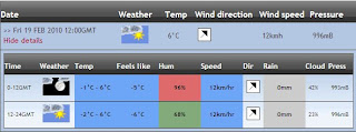
As you can see from the weather forecast there will 0mm of rain which means that will should be able to film on the 19th February and stick to our schedule. The weather will fit in with our narrative storyline and genre because we are not portraying a happy story so the cloudy weather will help to convey this.
http://theweatheroutlook.com/twoforecasts/forregdaily.aspx?postcode=NN6+8EW&selected=0
Wednesday, 10 February 2010
Shooting Schedule
Friday 19th February 2010-
We will begin to film the narrative part of the video in Long Buckby, Northampton. We have permission from Henry Sleight and Greg Tress to film the inside shots in their houses. We will start filming at mid-day and continue through the afternoon. If the weather is not suitable will will re-schedule to Saturday 20th February.
Saturday 20th February 2010 -
We will film the performance part of our video in Long Buckby, Northampton.

The first location we will film is Henry's house, this will include all the narrative with the first couple that is shown in the video. To the left are all the shots that we will film there.

The second location that we will film at is Greg's house, this will include all the narrative with the second couple in the video. To the left are all the shots that we will film there.

The third location we will shoot at is the alleyway in which we will film all the outside shots. To the left are all the shots we will film there.

The final location we will shoot at is Long Buckby to film the performance part of the video.
Improved Animatic
This improved animatic shows our new ideas. As we decided to change our storyline, making a new animatic was compulsory as it would make it a lot easier when it came to filming, as we would know what shot we should be doing at a certain point in the song.
Improved Lyrics
Annotating the lyrics will help when it comes to linking the visuals with lyrics. It will also help with timing because if we are certain of what will happen in the video at specific points in the lyrics, we will know the amount of time we have for each shot and event in the story.


Improved Storyboard
We decided to change our ideas because we felt that on our other storyboard the two narratives may be complicated, and may get confusing to our target audience. Our new storyboard of ideas includes one narrative, helping the continuity of the video flow from beginning to end. We also found from our research that it was not typical of the Indie genre to have two storylines.


This is the directors pitch that we will now be using:


This is the directors pitch that we will now be using:

Wednesday, 27 January 2010
Lyrics
I have looked at interpretations of the lyrics to help me understand the meaning of the song when i come to annotating them myself.
http://www.lyricinterpretations.com/The-Killers/Mr-Brightside
'The key in this song is its title. By calling himself Mr Brightside, the speaker is commenting on how he is incurably optimistic - he always looks at the bright side of any given situation.
The song is about his propensity for getting overly involved emotionally with women he has only just met, and suffering heartbreak when his love proves to be unrequited. His "destiny" is to continually experience such heartbreak because he always opens up his "eager eyes" to the next possible paramour.
To get into a closer reading, look at the first stanza:
Coming out of my cage
And I've been doing just fine
Gotta gotta be down
Because I want it all
Here, he is freeing himself from the emotional restraint that was protecting him from having his heart broken and allowing himself to become interested in a girl. The "all" that he wants refers to true love, the kind that you can only get if you are willing to give the entirety of yourself to someone else.
It started out with a kiss
How did it end up like this
It was only a kiss
It was only a kiss
Here, he's wondering how he's gotten to the point that he cares so deeply about her after just one kiss - the answer is because he allowed himself to invest that kiss with meaning that for her was not there.
The next couple stanzas basically tell the story of him seeing this girl that kissed him once hanging out with other guys - and because he feels so strongly for her, he becomes deeply jealous/angry. It's sort of like a situation where two people made out on a dance floor one night, and the girl felt like she was just having fun whereas the guy thought there was actually a connection.
Where we get the best crystallization of Mr Brightside's true nature and motivation is in the following stanza:
But it's just the price I pay
Destiny is calling me
Open up my eager eyes
'Cause I'm Mr Brightside
Here, we should be getting that the "price" he pays is the intense feelings of jealousy, rage, and heartbreak that come from his penchant for getting too attached too fast. He asserts that it is out of his hands, that this pattern of behavior is simply part of his core personality by referring to it as his "destiny." His eyes are "eager" for the next girl that he will fall for, which is sure to happen because he is the perpetually optimistic "Mr Brightside" - always looking for and ready for love.'

I have annotated the Mr Brightside lyrics to show the relationship between the lyrics and visuals. This will help with the timing when it comes to filming and editing our video. It shows a very brief description of how the visuals will relate to the lyrics.
Storyboard Three


This is the storyboard that me and Rebecca have decided to use for our music video. It shows two different narratives, emphasising that many of our target audience are in the same situation with relationships, whilst sticking to the Indie genre with the performance based part of the video. This is the director's pitch that we will be using:

Storyboard Two
This storyboard shows two couples with one narrative. It is a hybrid meaning that it includes performance and narrative based parts within the video.


Storyboard One
We drew up a storyboard for each of our directors pitch's to help us decide which one would be best to use for our video. The storyboard's will help us see how the video will come together, incorporating the time length and lyrics into the story.
This storyboard shows a completely performance based video.

This storyboard shows a completely performance based video.


Wednesday, 20 January 2010
Permission for Song Use
As The Killers were signed with Island Records when the second video of Mr Brightside was released, we are going to e-mail them to find out if we can use the song for our coursework. If we used the song without permission it would go against the copyright law.

It stated on the Island Records website that they are very busy with e-mails, so if we do not get a reply then we will go ahead with our video.

It stated on the Island Records website that they are very busy with e-mails, so if we do not get a reply then we will go ahead with our video.
Tuesday, 19 January 2010
Mr. Brightside
This is the actual video for The Killers - Mr. Brightside. I am going to analyse this to see of there are any generic features that link with those from other Indie music videos that i have researched.
- Demonstrate genre characteristics
This Killers video is a hybrid, meaning that it uses both performance and narrative within the story. From my research i found that this was typical of the Indie genre, and must make my own video a hybid to stick to the genre. Many close ups of the lead singer, Brandon Flowers, help the audience establish that the focus is on him and that he is the main member of the band. This is alo reinforced because he is present in the narrative part of the video as well. When making my own video i will make sure that the main member of the band is known by using close ups of him singing and standing him at the front of the band. The instruments used in this Killers video are drums, guitar and chelo. Chelos are not typical of the Indie genre so in my own video i will use drums, guitars and a microphone as these are present in many Indie videos.
- Relationship between lyrics and visuals
There is a strong link between the lyrics and visuals of this video. There are many interpretations of the meaning of the song, but from the video the audience can clearly see that the lead singer, Brandon Flowers, is emotionally involved with a girl that he has only just met. This links with the lyrics 'it started out with a kiss, how did it end up like this, it was only a kiss,' conveying that he has kissed the girl and now wonders why he is totally in love with her. Finding that she is with someone else he trys to look on the brightside, hence the song being named 'Mr Brightside.' As this is typical of the Indie genre when i come to storyboard my own ideas i will annotate the lyrics to make sure that i have a link between lyrics and visuals.
- The demand of the record label
The first close up of a member of the band is of the lead singer, portraying that he is the main member of the group and that he is the main focus. This is reinforced when mid shots and close ups are shown of the other members of the band, but only for a short time. The focus is then drawn back to the lead singer by another close up and for a longer period of time. I will incorporate this into my own video.
The Killers - Mr. Brightside
The artist and song that me and Rebecca have chosen to research and use in our coursework is The Killers - Mr. Brightside. We chose this artist because The Killers fit in very well with the genre of Indie, we are also familiar with many of their songs so we can relate our video to others of the band. This will make sure that we follow the key generic features of an indie music video. We chose the song, Mr. Brightside, because we felt that the lyrics gave us a lot of lee-way with what we could include in the video and can be interpreted in many different ways. This meant that we would not be limited when planning our video. The lyrics also tell a story so we could include a narrative as well as having it performance based, which is typical of the indie genre.
The Killers (Wikipedia) -
The Killers are an American based band, formed in 2002. The band consists of Brandon Flowers, Dave Keuning, Mark Stoermer and Ronnie Vannucci Jr. The name 'The Killers' comes from the bass drum of a fictional band in the music video, New Order - Crystal. They have released 4 albums, Hot Fuss (2003), Sam's Town (2006), Sawdust (2007) and Day & Age (2008).
The record label, Lizard King (UK), now known as Marrakesh Records, first signed The Killers. Other record labels that The Killers have previously and currently been signed with are, Island (US) and Vertigo (UK).
Mr. Brightside (Wikipedia) -
Mr. Brightside was released in August 2003 from the album Hot Fuss and reached the top 10 in the UK. There are 2 videos for Mr. Brightside, the UK version is the original version and was The Killers first video; due to the fact that the band were on an independent record label the video was done with a low budget and was subsequently very basic. When they were signed by Island Records in the US the band decided to film a higher budget video: the American video for this song stars Flowers, Izabella Miko, and Eric Roberts in a love triangle, taking place within the context of a burlesque show. Directed by Sophie Muller, it was inspired by the 2001 film Moulin Rouge.
Generic Features - Indie Music Video
The 4 videos that me and Rebecca researched were:
The Killers - Human
The Kooks - She Moves in Her Own Way
The Killers - Bones
Maximo Park - Books from Boxes
Key generic features of an Indie music video:-
- Camerawork
A close up of the lead singers face is a main key feature, as it immediately shows the audience which member of the band the focus is on. In The Killers video, Human, a close up of Brandon Flowers portrays to the audience that he is the central member of the band. This is also shown in the other 3 videos that me and Rebecca looked at.
In 3 of the 4 videos, a mid angle, long master shot of the band is used. This very much links with the indie genre because all of the videos we looked at were performance based, meaning that the master shot emphasises the genre and shows the audience the band altogether; also showing the closeness of the group.
Extreme long mid angle shots of the band playing shows the unity of the group as a whole and seperates the performance from the narrative.
- Mise-en-scene
In all 4 of the videos the costumes were very slick, not too casual but not extremely formal. The costumes consisted of dark colours, suits and formal jeans/ trousers.
The costumes in the narrative based storyline also consisted of dark colours, helping it to blend into the video and not stand out as something completely different. It also keeps the focus on the band and the performance.
The setting of 2 of the videos was based in the city and 2 were set in the desert. As our video must be workable and realistic we would base ours in a city/ town as it would not be workable to film in the desert.
The props used in all 4 of the videos was instruments and a microphone. This is a typical feature of an indie music video because as they are mainly performance based the band must play as if to an audience. This means it must include all instruments.
- Editing
All of the videos used continuity editing, meaning that there is a beginning and an end to each. 3 of the videos followed a basic storyline whilst cutting back to the master shot of the band.
Jump cuts were also used in all of the videos, cutting from the narrative back to the performance. The performance based part of the video would show the band singing the chorus of the song, whereas the narrative would be shown during the verses.
All the video were cut off beat.
- Style of video
3 out of 4 of the videos were both performance and narrative based, meaning that they are a hybrid.
- Links between visuals and lyrics
The links were illustrated and amplifyed in all of the videos.
- Links between visuals and music
The links were illustrated and amplifyed in all of the videos.
Monday, 18 January 2010
Target Audience Conclusion
- Music Videos
All of the people from our target audience that we interviewed, or filled in our questionnaire watched music videos. The majority also watched them on the internet, meaning that when we come to storyboarding our own ideas we must make sure they are suitable to be shown on the internet. They also thought that the video should tell a story, this means that we must incorporate this into our video by linking the visuals and lyrics. This will keep our target audience interested and will help them relate to it; it will also help them relate to it if the actors in the narrative part of the video are of the same age as our target audience.
- Digipaks
Just over half of the people who filled in our questionnaire, and that we interviewed buy digipaks. The majority said that the front cover influences the sale and that colours and the background image would sway them into buying the digipak. When designing my own digipak i will use bright colours on my background image to catch the consumers eye and to ensure that it is interesting and appeals to my target audience.
- Advertisements
All of the people we asked bought magazines, but less than half bought a digipak because it had been advertised in a magazine. This means that when i design my own advert i will need to make it stand out enough to sway my target audience into buying my digipak. To do this i will use bright colours and make the artist name stand out to help distinguish the digipak that i am advertising.
Subscribe to:
Comments (Atom)